

PACKAGING DESIGN FOR HEART CUT
Who are they?
The Heart Cut is an independent bottler founded by whisky and cocktail experts Georgie Bell and Fabrizio Leoni. Named Best Independent Bottler at the Whisky Awards 2024/25, they specialise in uncovering and sharing exceptional spirits from around the world.
The Brief:
I created custom packaging for four of The Heart Cut’s limited release batches, each made in collaboration with a different brewery.
The designs need to be tailored to reflect the unique flavour profiles of the whiskies while also drawing inspiration from the distilleries’ locations or reinterpreting elements of their visual identity.
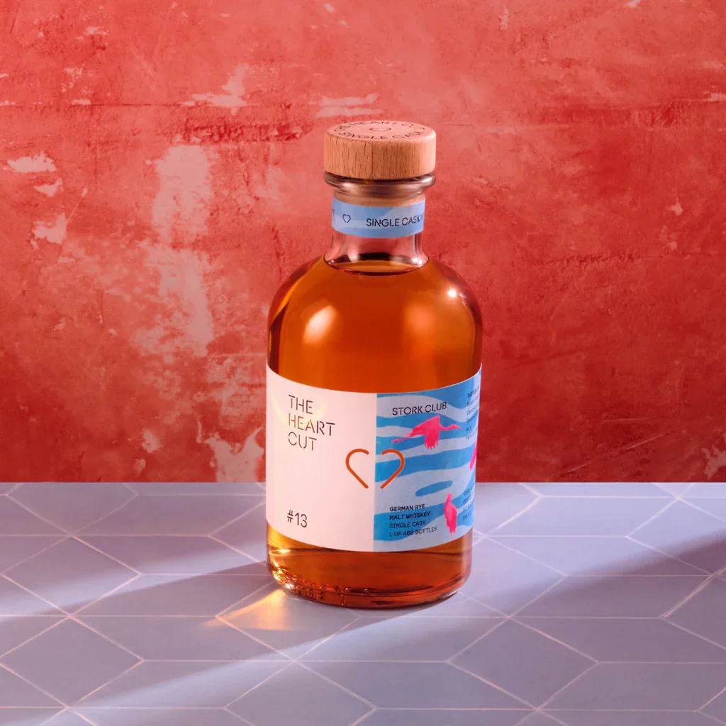
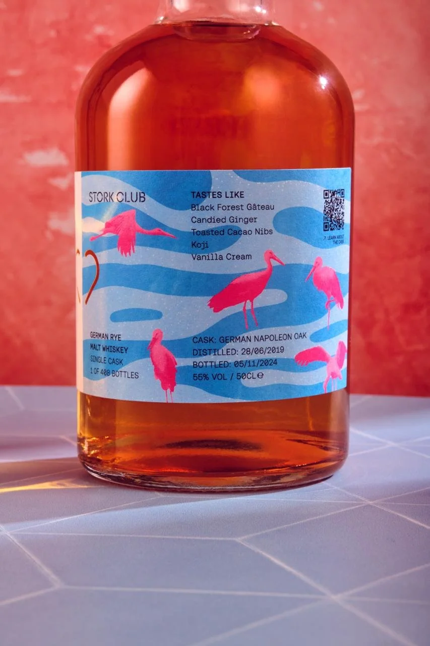
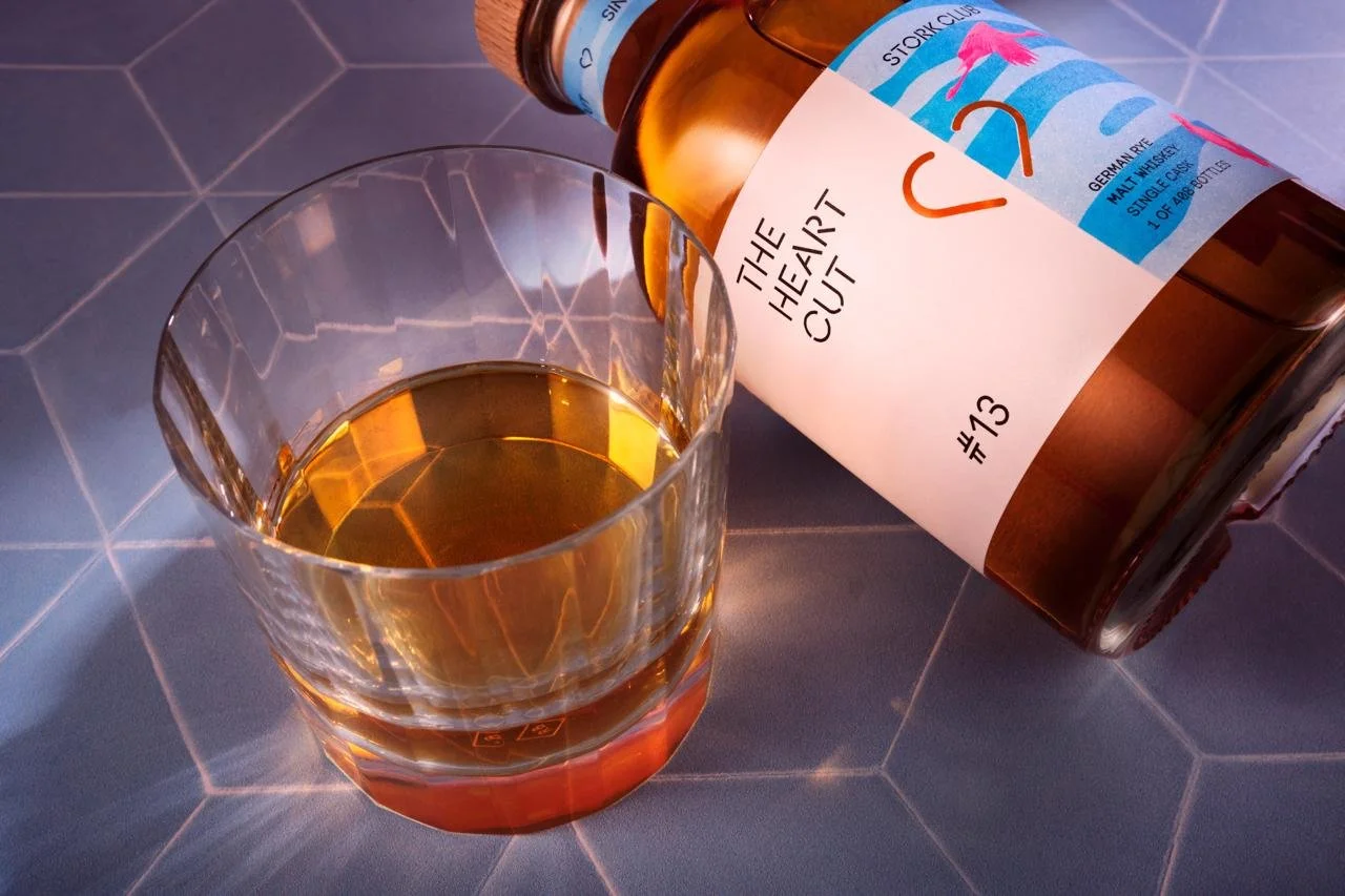
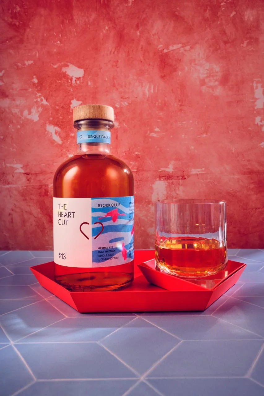
#13 Stork Club:
The brief for the Stork Club release called for a design that echoed the brand’s bold, two-tone label style, with a playful use of pattern. My client asked for the Stork Club’s signature stork to feature prominently. They also suggested a colourful pattern approach to tie everything together.
#12 NC’NEAN:
The Heart Cut briefed me to create packaging for their collaboration with Nc’Nean, an independent organic whisky distillery known for its experimental spirits and commitment
to sustainability.
For this release, the direction centred on reflecting Nc’Nean’s ethos of
“made by nature, not by rules.” My client wanted a design inspired by the rugged Scottish landscape, with a predominantly blue label accented by flashes of green.


#11 J.J.CORRY:
For The Heart Cut’s collaboration with JJ Corry, the brief focused on capturing both the Irish heritage of the brand and the unique character of the release.
The client asked for a touch of green to reflect JJ Corry’s roots, paired with complementary purple tones inspired by seasonal foliage.


#10 WIREWORKS DISTILLERY:
For The Heart Cut’s collaboration with Wire Works, the brief was to reflect the distillery’s proud Derbyshire heritage and award-winning single malt. The whisky itself was matured in tawny port casks, inspiring the use of a rich ruby red palette.


BRANDING FOR
HEART CUT’S
’SLOW WHISKY CLUB’ &
’HEART + HEART’
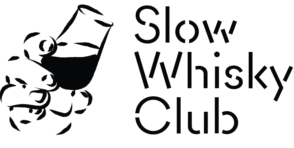
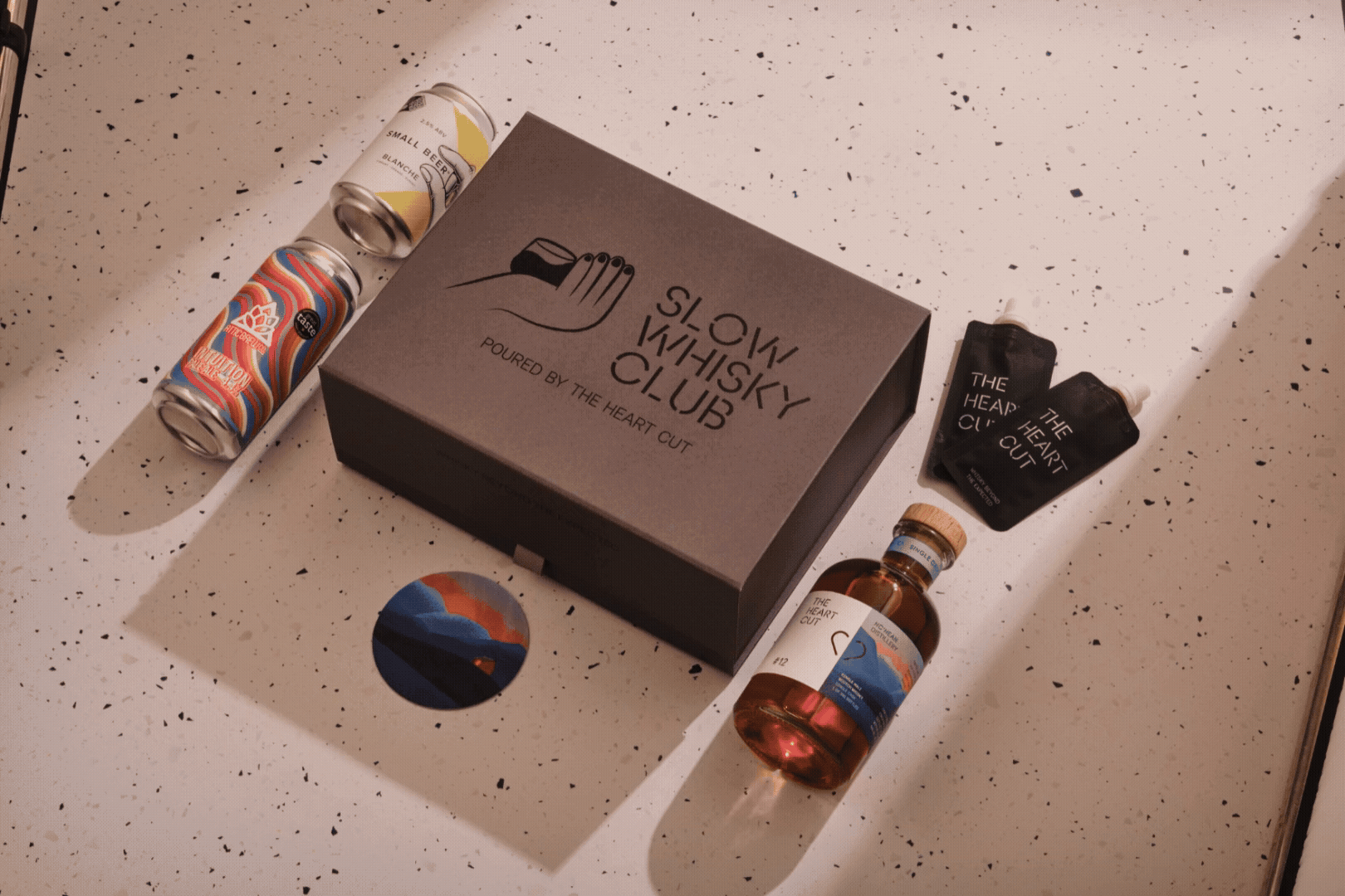
The Slow Whisky Club
The Heart Cut asked me to create a logo and design assets for The Slow Whisky Club
— their new community hub for whisky lovers and brand fans. The club is all about celebrating whisky as a social, convivial spirit that sparks conversation and brings people together.
The brief called for a logo that aligns with The Heart Cut’s existing brand identity but with a slightly more playful tone, while still feeling premium and recognisable. The identity needed to be flexible enough to carry across multiple membership levels and work as the visual anchor for this new community space.
INITIAL IDEAS:

FINAL DESIGN:

Half & Heart Pairings
The second part of the brief was to design a wordmark logo and complementary graphic asset for Half & Heart Pairings, The Heart Cut’s take on the classic half’n’half serve (a dram of whisky with half a beer).
The aim was to capture the ritual and fun of enjoying whisky and beer side by side—not as a shooter, but as a relaxed back-and-forth. The client wanted a design bold enough to live on merchandise (t-shirts, sweaters, bags) and adaptable enough for use on beer coasters and event collateral. The look needed to tie into The Heart Cut’s visual identity, while still having its own distinct, playful character.

INITIAL IDEAS:

FINAL DESIGN: